
#Branding #StyleGuide #EdTech #BrandArchitecture
EICOM Institute
From fragmented programs to unified premium brand — building a scalable visual system that elevated an education institution's perceived value
Fragmentation Problem
3-4 programs with disconnected identities – scaling impossible without unified system
Strategic Pivot
Phronesis (practical wisdom) as foundation – building brand architecture around executive learning philosophy
Brand Transformation
Scaled from 3-4 fragmented programs to 8+ programs sharing visual DNA — brand system enabled 2x growth while maintaining consistency
Context & Challenge
The interview moment that became the project: During final interview round with EICOM's Head of Brand, I was asked: "If you could redesign any well-known company's brand, which would you choose?"
Rather than naming Apple or Coca-Cola, I analyzed EICOM's own logo — outlining specific refinements that could better reflect their mission. That conversation became my first task as Senior Designer: complete brand redesign.
But the reality was more challenging.
Once inside, the problem revealed itself as systemic fragmentation — not just outdated logo, but complete absence of brand architecture. Three core programs (DCE, CMX, EICOM Experience) operated as separate entities with disconnected identities. No shared visual language. No scalability framework. Executive audience (C-level professionals) couldn't perceive cohesion or premium positioning despite Cambridge partnership. This wasn't refinement work — this was ground-up brand system design.
Digital transformation needed visual identity that communicated both authority (institutional credibility) and accessibility (modern relevance) simultaneously. The brand had to bridge academia and innovation without sacrificing either. Worked closely with Head of Brand and Programme Development to align visual identity with strategic programme expansion roadmap — challenge shifted from "update logo" to "build scalable brand ecosystem supporting growth from 3-4 programs to 10+ while maintaining premium positioning."
Strategic anchor became Phronesis — ancient Greek concept (represented by Phi φ) meaning practical wisdom, good judgment, and virtue in action. This philosophy would influence every design decision from logo refinement to sub-brand architecture.
Unpacking the Work
What Was Broken


The Fragmentation Problem
→
Each program operated with different visual identity — no recognizable connection between DCE, CMX, and EICOM Experience
→
Executive audience couldn't identify institutional coherence despite Cambridge partnership and C-level positioning
→
Alumni reported discovering multiple programs belonged to same institution only after completing certifications
→
Scaling new programs required reinventing identity each time — no system to leverage, no brand equity to build upon
→
Visual inconsistency undermined premium positioning — looked like startup collection rather than established institution

1
Outdated Typography
The serif font, while classic, feels overly ornamental and does not reflect the innovation and forward-thinking nature of the institute.
2
Inconsistent Line Weights
The shield contains elements with mismatched strokes, which undermines cohesion and makes the overall mark appear unrefined.
3
Misaligned Angles
The lower stripes use angles that feel visually awkward and disconnected from the rest of the shield's geometry.
4
Illegible Monogram
The inner "coded" monogram is overly stylized and difficult to decipher, especially at small sizes—hindering brand recognition.
Key Decisions
Refinement vs. complete redesign?
Why Evolution Won
-
Shield/book symbol had recognition equity — alumni would still recognize brand
-
Academic credibility from traditional elements — necessary for Cambridge partnership
-
Refinement signals maturity — "we're evolving" vs. "we're starting over"
What We Rejected
-
Complete redesign: Would confuse existing students, lose recognition equity
-
Minimal modern logo: Lost academic authority, felt too startup-like
-
Keeping everything: Original problems would persist — inconsistency would remain
Unified single brand vs. distinct sub-brands?
Why Brand Umbrella Won
-
Parent identity (EICOM Institute) provided cohesion across touchpoints
-
Sub-brands (CMX, DCE, Review) could differentiate while maintaining family resemblance
-
Allowed programs to launch quickly using system — not reinventing identity each time
-
Elevated all programs through association — "from EICOM" became quality signal
What We Rejected
-
Single monolithic brand: Programs couldn't differentiate offerings, felt restrictive
-
Completely independent brands: Original problem persisted — zero cohesion
-
Numbered programs (EICOM 1, 2, 3): Felt corporate/cold vs. educational warmth
Why Phronesis over other philosophical concepts?
Why Phronesis Won
-
Balanced theoretical knowledge with practical application — EICOM's core positioning
-
Phi (φ) symbol visually distinctive and adaptable to logo geometry
-
Resonated with executive audience: wisdom through experience, not just credentials
-
Ancient Greek origin aligned with Cambridge partnership and institutional authority
What We Rejected
-
Latin terms (Veritas, Lux): Too generic, used by hundreds of institutions
-
Commerce-specific metaphors: Narrowed brand to transactions vs. transformation
-
Innovation-focused terms: Felt startup-y, undermined institutional credibility

Why Notion for style guide hosting?
Why Notion Won
-
Living document — could update without developer bottleneck or PDF versioning chaos
-
Already adopted internally — zero onboarding friction for team members
-
Searchable + commentable — marketing/design teams could ask questions inline
-
Free for organization — budget constraints favored zero-cost scalable solution
What We Rejected
-
Static PDF: Would become outdated instantly, no version control
-
Custom website: Required developer time, maintenance overhead, delays
-
Figma only: Design team accessed but marketing/education teams excluded
What We Built

Visual Identity System
-
Refined logo (primary + secondary applications) with improved geometry and legible Phi monogram
-
Custom typography balancing academic authority with modern accessibility
-
Color system expressing institutional credibility while remaining digitally adaptable
-
Clear area guidelines, minimum sizes, and protective grid for consistent application
Primary use


Secondary use


Protective grid - Clear Area
Minimum size

Brand Umbrella Architecture
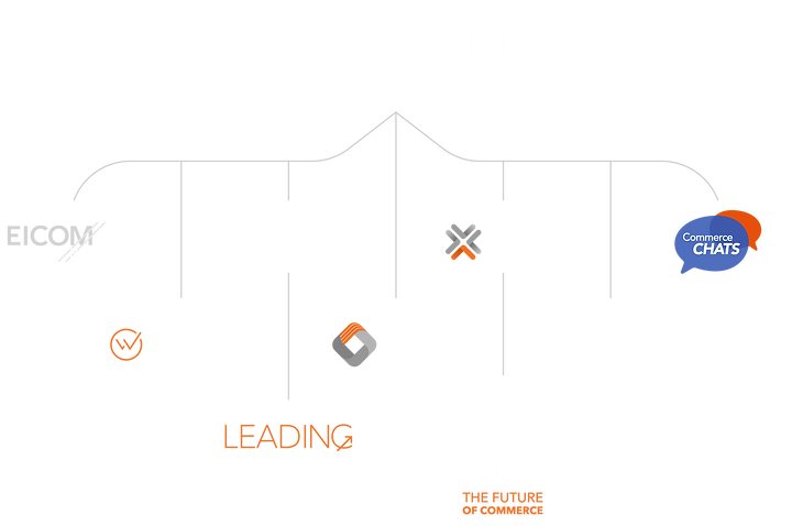
-
Parent identity (EICOM Institute) unifying all programs with shared visual DNA
-
8+ coherent sub-brands: Review, Wiki, News, Alumni, CMX, Commerce Chats, DCE, Cambridge Experience
-
System allowing programs to differentiate offerings while maintaining family resemblance
-
Scalable framework enabling future programs to launch without identity reinvention
Brand Umbrella Architecture


-
Centralized documentation: colors, typography, tone of voice, iconography, layouts
-
Accessible to design, marketing, and education teams without technical barriers
-
Searchable, commentable, and updateable — eliminating PDF version chaos
-
Asset library with downloadable logos, templates, and brand components
Icon Library & Visual Language
Comprehensive icon system designed for educational, certification, and content programs. Visual language balanced academic symbolism (books, shields, graduation) with digital innovation (networks, growth, transformation). Icons maintained consistency with logo geometry — circular shields echoing parent brand while allowing programmatic differentiation through color and supporting elements.
Templates & Workflows
-
Scalable presentation templates for pitch decks, educational content, and partner materials
-
Institutional graphics system for events (including VTEXDay exhibition stand)
-
Customer journey visualizations for certifications (CMX) translating complex learning paths
-
Workflows ensuring consistency across digital transformation and accreditation initiatives

Brand in the Wild
Design system proved scalability beyond digital touchpoints — translating brand identity into physical spaces, print collateral, and high-stakes events while maintaining consistency and elevated positioning.
Context
Designed brand activation for VTEXDay — founder company's flagship annual event. High-visibility opportunity bringing together EICOM's multicultural team (Cambridge/São Paulo/Remote) in single physical space for first time.
Challenge
Translate brand identity into 3D exhibition space while communicating EICOM's educational value proposition. Stand needed to tell career progression story — how users journey from foundational programs to executive leadership through EICOM's ecosystem.
Solution
Created custom graphics system visualizing career ladder metaphor: DCE (foundation) → CMX Certifications (Levels 1-3 progression) → EICOM Experience Cambridge (executive pinnacle). Visual storytelling used brand umbrella elements, Phronesis symbols, and program-specific colors to show unified yet differentiated pathway.
Impact
High-visibility brand touchpoint reinforcing institutional credibility in context where VTEX executives, partners, and commerce leaders converged. Stand demonstrated brand system's adaptability: digital identity translating seamlessly to physical space without losing coherence or premium positioning.


Brand Applications
Visual system deployed across all touchpoints — proving brand consistency works at any scale, from social media posts to physical event stands.


Recognition & Adoption
Now it feels like premium institution that justifies investment.
— Executive audience feedback (post-launch)
Internal Adoption
Style guide became go-to resource for marketing, design, and program teams — eliminating redundant "what colors should we use?" conversations
Cross-Department Usage
Brand assets requested for partnership materials and international programs — visual identity extended beyond original scope
Executive Programs Elevation
Visual identity applied to Cambridge collaboration and C-level certifications — premium positioning reinforced in high-stakes contexts
new programs launched
8
Design system enabled rapid program expansion while maintaining unified brand architecture
team members accessing guide
+15
Cross-functional adoption across marketing, education, partnerships, and content teams
Design Reflection
Complexity Navigated
Balancing 10+ distinct programs with C-level audience expectations while maintaining institutional credibility. Challenge wasn't creating "pretty logo" — it was designing visual system that could scale across executive education (Cambridge), certifications (CMX/DCE), content platforms (Review/Wiki), and community (Alumni) without fragmenting identity.
Approach Taken
Started with philosophical foundation (Phronesis) before touching visuals. Led collaborative workshops with brand, marketing, and education teams to align on strategic direction. Documented every design decision's rationale — not just "looks better" but "reinforces practical wisdom positioning while maintaining academic authority." Prioritized evolution over revolution to preserve recognition equity.
Architecture Designed
Brand umbrella system allowing parent identity to provide cohesion while sub-brands differentiated offerings. Visual DNA (shield geometry, Phi symbol, typography, colors) remained consistent — programs varied through secondary elements and color emphasis. Living style guide on Notion ensured system remained accessible and updateable as organization evolved.
Value Elevated
Visual identity transformation shifted perception from "collection of courses" to "premium institution." Executive audience feedback confirmed positioning elevation — brand now justified investment expectations. Design system became efficiency multiplier: 8+ programs launched maintaining consistency, marketing assets produced faster, cross-department collaboration streamlined.
Core Principle
Brand isn't logo — it's complete experience ecosystem. Every touchpoint (website, certification, event stand, social media, partnership material) either reinforces or dilutes brand promise. Phronesis concept worked because it influenced decisions beyond visual: tone of voice, program structure, learning philosophy. Design became strategic tool, not decorative afterthought.
Personal Growth
Project reinforced that strongest work emerges from strategic clarity before visual execution. Interview moment (analyzing EICOM's logo before hired) taught me confidence to critique established systems while respecting their context. Leading collaborative workshops refined ability to facilitate diverse stakeholders toward unified vision. Seeing 8+ programs launch using system validated approach: scalable frameworks amplify impact beyond individual executions.
Interested in Brand-Led transformation?
Every touchpoint either reinforces or dilutes brand promise. Let's ensure yours reinforces.